Greige Color Combinations Tool
Choose Your Greige Shade
Select Your Accent Color
Your Greige Combination
Ever walked into a showroom and felt that the room was bright without a single wall painted stark white? The secret is that designers have quietly swapped the classic white for a softer, more forgiving hue. In 2025 the color replacing white in most modern homes is a warm, muted shade that looks clean but never feels sterile.
What Is Greige?
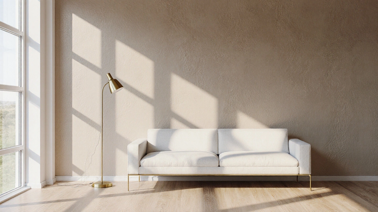
Greige is a blend of gray and beige that creates a warm, earthy neutral. It offers the calmness of gray while retaining the inviting feel of beige, making it a versatile backdrop for any style. Think of it as the perfect middle ground between crisp white and deep charcoal.
Why Greige Is Overtaking White
- Light Management: Greige reflects natural light softly, reducing glare in bright rooms while still keeping spaces feeling airy.
- Psychology: Studies from 2023 show that warm neutrals lower stress levels better than stark whites, especially in home offices.
- Design Flexibility: It pairs effortlessly with wood tones, bold colors, and even glossy finishes, giving homeowners room to experiment.
How Greige Works With Popular Styles
Whether you love mid‑century modern, farmhouse chic, or minimalist Zen, greige adapts:
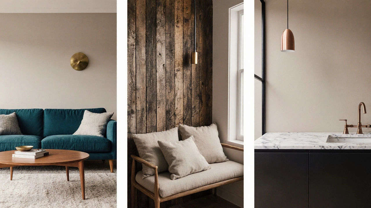
- Mid‑Century Modern: Pair greige walls with teak furniture and brass accents for a timeless look.
- Farmhouse Chic: Combine greige with reclaimed wood, copper fixtures, and soft linens for cozy warmth.
- Minimalist Zen: Use matte greige alongside white marble countertops and simple black metal frames for a serene vibe.
Palette Pairings: Colors That Shine With Greige
Greige isn’t meant to stand alone; it thrives when paired with complementary tones. Below are five tried‑and‑true combos:
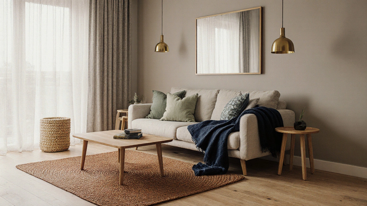
- Soft Sage: A muted green that adds a subtle pop of nature without overwhelming.
- Warm Beige: For an even softer, monochromatic feel that leans more toward traditional comfort.
- Charcoal: Perfect for accent walls or cabinetry to create depth.
- Terracotta: Introduces a warm, earthy contrast ideal for Mediterranean‑inspired rooms.
- Navy Blue: Offers a sophisticated, high‑contrast look when used in textiles or décor.
Alternatives to Greige: When You Want Something Different
Not everyone is ready to fully commit to greige. Here are three close cousins that are also gaining traction:
- Soft Sage is a muted green‑gray that evokes a garden after rain. It works especially well in bedrooms where a calming vibe is desired.
- Warm Beige leans more toward yellow undertones. It’s a safe bet for traditional interiors that still want a hint of modernity.
- Charcoal adds drama without the starkness of black. Use it on lower cabinets or a feature wall to anchor a space.
Choosing the Right Shade of Greige
Greige comes in a spectrum from light, almost‑white tones to deeper, richer shades. To nail the perfect match:
- Check the room’s natural light. Sun‑lit spaces can handle deeper greiges; north‑facing rooms benefit from lighter tones.
- Look at existing flooring. Light hardwood pairs with darker greige, while darker floors look balanced with lighter greige.
- Test three swatches side‑by‑side on the same wall and observe them at morning, noon, and dusk.
Application Tips: From Paint Finish to Accessories
Painting with greige is straightforward, but a few tricks elevate the result:
- Finish Choice: Matte or eggshell finishes hide imperfections, while satin offers a subtle sheen for high‑traffic areas.
- Accent Materials: Incorporate Natural Wood flooring, light oak or walnut to reinforce warmth.
- Metallic Touches: Brass or brushed gold hardware adds a luxurious contrast without overpowering the neutral backdrop.
- Textiles: Throw pillows in Terracotta or soft pink inject color without clashing.
Common Mistakes and How to Avoid Them
Even a popular hue can go wrong if misused:
- Over‑matching: Using greige on every surface can make a home feel flat. Mix in textures and contrasting colors.
- Ignoring Undertones: Some greiges have cool blue undertones; pairing them with warm wood can create a discordant look.
- Skipping Test Swatches: Lighting dramatically changes perception. Always test before committing.
Quick Checklist for a Successful Greige Makeover
- Determine natural light direction.
- Select a greige shade with undertones that complement flooring.
- Choose a matte or satin finish based on traffic.
- Plan accent colors (soft sage, charcoal, terracotta, navy).
- Incorporate texture: wood, metal, woven fabrics.
- Test three swatches on the main wall for 48 hours.
- Apply primer for best color accuracy.
Comparing Greige With Other Trending Neutrals
| Color | Undertone | Best Lighting | Typical Pairings |
|---|---|---|---|
| Greige | Gray‑beige | All lighting, especially natural | Wood, brass, navy, terracotta |
| Soft Sage | Green‑gray | Bright or filtered light | White, ivory, warm wood |
| Warm Beige | Yellow‑beige | North‑facing rooms | Chocolate brown, muted teal |
| Charcoal | Deep gray | Well‑lit spaces | Gold, copper, crisp white |
FAQs About Greige and Its Rise
Frequently Asked Questions
Is greige a good choice for small rooms?
Yes. Because greige reflects light softly, it can make a compact space feel larger without the starkness of pure white.
How does greige compare to traditional white in terms of maintenance?
Greige tends to hide scuffs and minor marks better than bright white, reducing the need for frequent touch‑ups.
Can I use greige on ceilings?
A very light greige works well on ceilings, especially in rooms with high ceilings, adding warmth without lowering the visual height.
What paint finish works best for greige walls?
Eggshell or satin finishes strike a balance between durability and a soft sheen, keeping the color looking fresh.
Is greige suitable for bathroom tiles?
Yes, especially when paired with white fixtures and natural stone. It creates a spa‑like ambiance while masking water spots better than pure white.