Kitchen Color Mood & Trend Finder
Select a color palette below to see its recommended mood, best uses, and lighting tips according to current 2024 design trends.
Mood & Atmosphere
Best For
Lighting & Maintenance
- Lighting:
- Maintenance:
- Pair With:
You’re standing in the paint aisle, staring at thousands of swatches, wondering which one will make your kitchen feel fresh rather than dated. It’s a common paralysis. We’ve all been there, holding a sample of "Greige" while secretly fearing it looks like beige with an identity crisis. But here’s the truth about kitchen color trends for 2024: we aren’t just picking a hue; we’re setting a mood. The era of sterile, all-white boxes is fading fast. In its place, we’re seeing a shift toward warmth, depth, and personality.
If you’re planning a renovation or just want to refresh your space without tearing down cabinets, understanding where color psychology and design trends intersect can save you from expensive mistakes. This isn’t about following a fad blindly. It’s about choosing a palette that feels good to live in, holds up against daily wear, and adds value to your home. Let’s break down what’s actually working in kitchens right now, why these colors are winning, and how you can pull them off without looking like a Pinterest fail.
The Shift Away From Sterile White
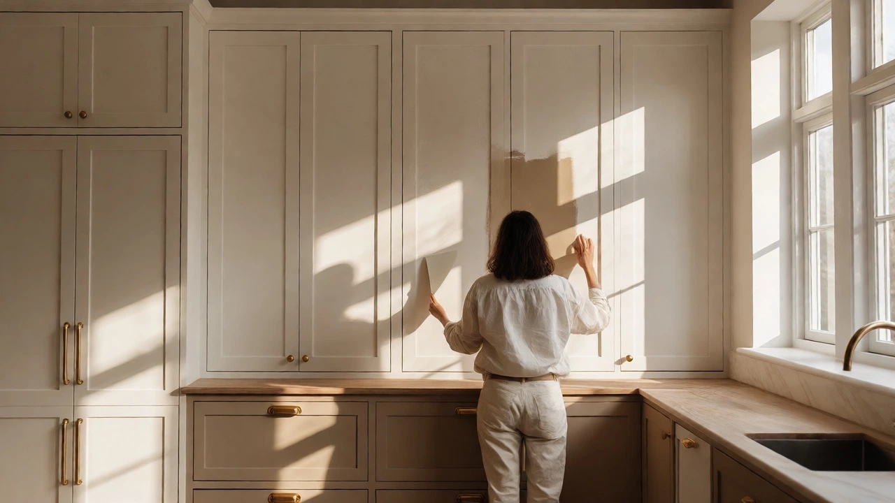
For over a decade, white was the default. It signaled cleanliness, brightness, and spaciousness. But by 2024, pure white often reads as cold or clinical. People want their kitchens to feel inviting, not like a dentist’s office. The trend has pivoted sharply toward Warm Neutrals and earthy tones that mimic natural materials. Think creamy off-whites, soft taupes, and sandy beiges. These colors reflect light gently, reducing glare while adding a cozy layer to the room.
Why does this matter? Because lighting changes everything. A stark white wall under cool LED bulbs can look blue-gray and harsh. A warm neutral absorbs some of that sharpness, creating a softer ambiance. If you have north-facing windows, which tend to cast cooler light, warm neutrals are your best friend. They counteract the chill and make the space feel grounded. You don’t need to repaint the whole house. Start with your upper cabinets or a feature wall. Pair them with brass or gold hardware to enhance that warmth.
Green Is the New Neutral
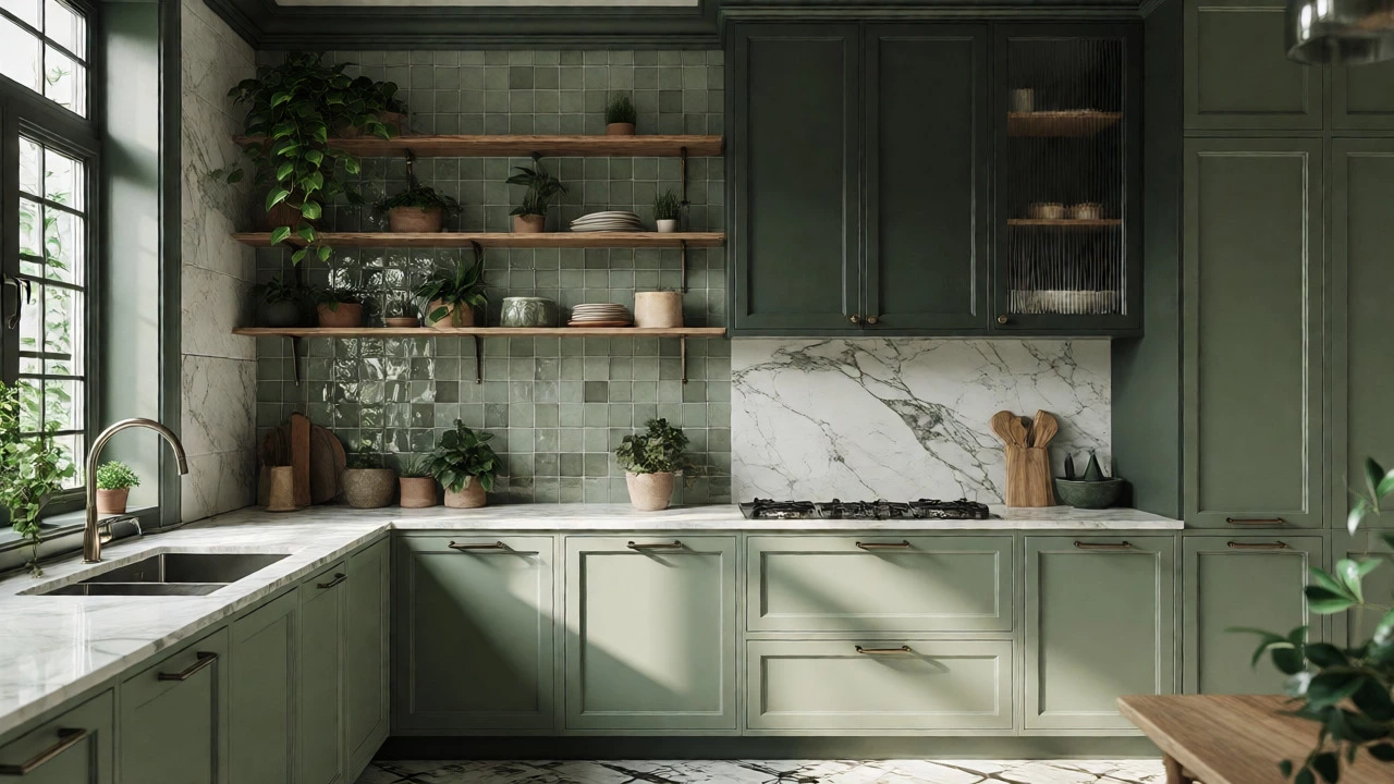
If you ask any interior designer what color they’re specifying most often, the answer is almost always green. Specifically, Sage Green and deep forest greens. This isn’t the bright lime of the 1970s. These are muted, sophisticated shades that blend seamlessly with wood tones, stone countertops, and metal fixtures.
Green works because it connects us to nature. Biophilic design-the idea that humans need contact with nature-has influenced home decor heavily. A sage green cabinet front paired with open shelving filled with plants creates an immediate sense of calm. It’s versatile, too. Lighter sages work well in small kitchens, making them feel airy yet distinct. Darker forest greens add drama and luxury, especially when combined with marble or quartz surfaces. Don’t worry about matching every element perfectly. Mixing textures-like matte green paint with glossy ceramic tiles-adds visual interest without clashing.
The Rise of Moody Blues and Charcoal
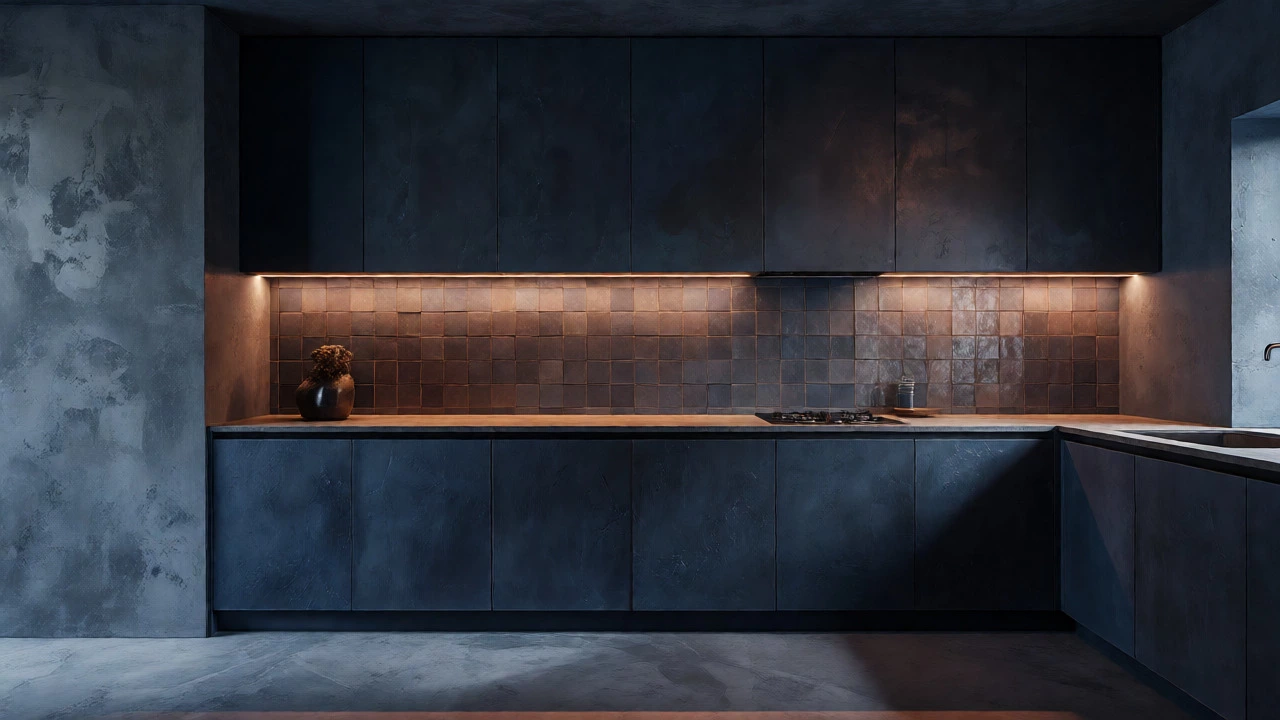
While greens and neutrals dominate, darker hues are carving out a significant niche. Navy Blue and charcoal gray are popular choices for lower cabinets, creating a grounded, anchored look. This two-tone approach-light uppers, dark lowers-is practical and stylish. Dark colors hide fingerprints and smudges better than white, which is a huge win for busy households.
Blue, in particular, evokes tranquility. It’s calming, which is exactly what you want in a high-traffic area where meals are prepped and conversations happen. Charcoal offers a similar effect but feels more industrial and modern. If you go dark, ensure you have adequate lighting. Under-cabinet lights become essential here. Without proper illumination, a navy kitchen can feel cave-like. But get it right, and you’ll have a space that feels exclusive and serene.
| Color Palette | Best For | Mood Created | Lighting Needs |
|---|---|---|---|
| Warm Neutrals (Cream, Taupe) | Small spaces, North-facing rooms | Cozy, Inviting, Clean | Low maintenance; reflects light well |
| Sage/Forest Green | Cottage style, Modern minimalism | Natural, Calm, Grounded | Moderate; pairs well with natural light |
| Navy/Charcoal | Large kitchens, Luxury aesthetics | Dramatic, Serene, Sophisticated | High; requires task lighting |
| Terracotta/Clay | Mediterranean, Boho styles | Earthy, Warm, Energetic | Moderate; enhances sunlit rooms |
Earth Tones and Terracotta Accents
Beyond the big three categories above, earthy reds and oranges are making a comeback. Terracotta and clay-inspired hues bring energy and warmth to the kitchen. These colors aren’t usually used on large cabinetry unless you’re going for a bold statement. Instead, they shine in backsplashes, island bases, or accessories.
Imagine a white kitchen with a terracotta tile backsplash. It breaks up the monotony without overwhelming the senses. Or consider a clay-colored island against sage green walls. The contrast is striking but harmonious. These tones remind us of handmade pottery and sun-baked landscapes, adding a tactile quality to the design. If you’re hesitant to commit to paint, try swapping out textiles or dishware first. See how the color makes you feel before buying gallons of primer.
How to Choose Your Shade: A Practical Checklist
Picking a color isn’t just about what looks good on a tiny chip. Context matters. Here’s how to narrow down your options:
- Test Large Samples: Buy peel-and-stick samples or paint poster boards. Move them around the room. Look at them in morning light, afternoon sun, and evening artificial light. Colors change dramatically throughout the day.
- Consider Fixed Elements: Do you have granite countertops you can’t replace? If your stone has pink undertones, avoid cool grays that might clash. Match your paint to the existing fixed elements first.
- Think About Maintenance: Dark colors show dust less but reveal water spots and grease easily. Light whites show everything. Mid-tones are often the easiest to keep clean.
- Check the Undertone: Every color has an undertone (yellow, blue, green, etc.). Use a white piece of paper next to your sample to identify it. Mismatched undertones create visual vibration that can be headache-inducing.
Avoiding Common Pitfalls
One major mistake people make is chasing trends too aggressively. If you paint your entire kitchen a hyper-specific shade like "Millennial Pink," you might tire of it in two years. Timeless palettes mix trendy accents with classic foundations. Keep your cabinets in a stable color like white, cream, or navy, and use your backsplash or accessories for the trendy pop.
Another trap is ignoring scale. A dark color in a tiny galley kitchen can shrink the space further. Conversely, a pale color in a massive open-plan kitchen might feel lost and unanchored. Balance is key. If your kitchen is small, stick to lighter values or use dark colors only on lower cabinets to draw the eye downward, creating an illusion of height.
Final Thoughts on Longevity
Kitchens are expensive investments. You don’t want to redo yours every time a new Pantone color drops. The best approach for 2024 is hybridization. Combine durable, neutral foundations with expressive, changeable elements. Paint your cabinets a timeless warm white or deep green. Then, let your stools, rugs, and art carry the seasonal trends. This way, you stay current without breaking the bank.
Remember, your kitchen should reflect your life. If you cook messy meals, maybe skip the pristine white island. If you love hosting, consider a social color like yellow or orange that stimulates conversation. Trust your gut more than the trend reports. After all, you’re the one living in the space.
Is gray still a good color for kitchens in 2024?
Cool grays are fading, but warm greys and charcoal remain strong. The key is avoiding blue-based grays that look sterile. Opt for taupe-infused grays or deep charcoal for a modern, grounded look that complements wood tones better than traditional cool gray.
What is the most popular kitchen cabinet color for 2024?
Sage green and warm neutrals like cream and beige are currently leading. Navy blue remains a top choice for those wanting drama. Pure white is declining slightly in favor of softer, warmer off-whites that feel less clinical.
Should I paint my kitchen ceiling the same color as the walls?
Not necessarily. Painting the ceiling the same color can make a low-ceiling room feel smaller. However, in very tall rooms, it can create a cozy, enveloping effect. Generally, keeping the ceiling a lighter shade than the walls helps maintain a sense of openness and height.
How do I choose a kitchen color if I have limited natural light?
Choose colors with warm undertones (yellow or red) to counteract the cool darkness. Avoid dark blues or greens unless you have excellent artificial lighting. Creamy whites and light taupes reflect available light best, making the space feel larger and brighter.
Are colorful kitchens hard to resell?
Neutral foundations sell easier. If you use bold colors, keep them on accent pieces or islands rather than all-over cabinetry. A sage green or navy kitchen is widely accepted, but neon or highly specific shades might limit buyer appeal. Always prioritize versatility if resale is a near-term goal.